Siding color trends for 2024 are shaping up to be a vibrant mix of classic and contemporary hues. This year’s palette reflects a growing awareness of environmental harmony and the psychological impact of color on home design. We’ll explore the top choices, delve into color psychology, and examine how architectural styles and natural surroundings influence the perfect siding color selection for your home.
From the calming influence of cool blues and greens to the welcoming warmth of earthy tones and bold accents, we’ll examine how color can transform your home’s exterior. We’ll also investigate unexpected color combinations that are gaining traction, offering inspiration for homeowners looking to create a truly unique and stylish façade.
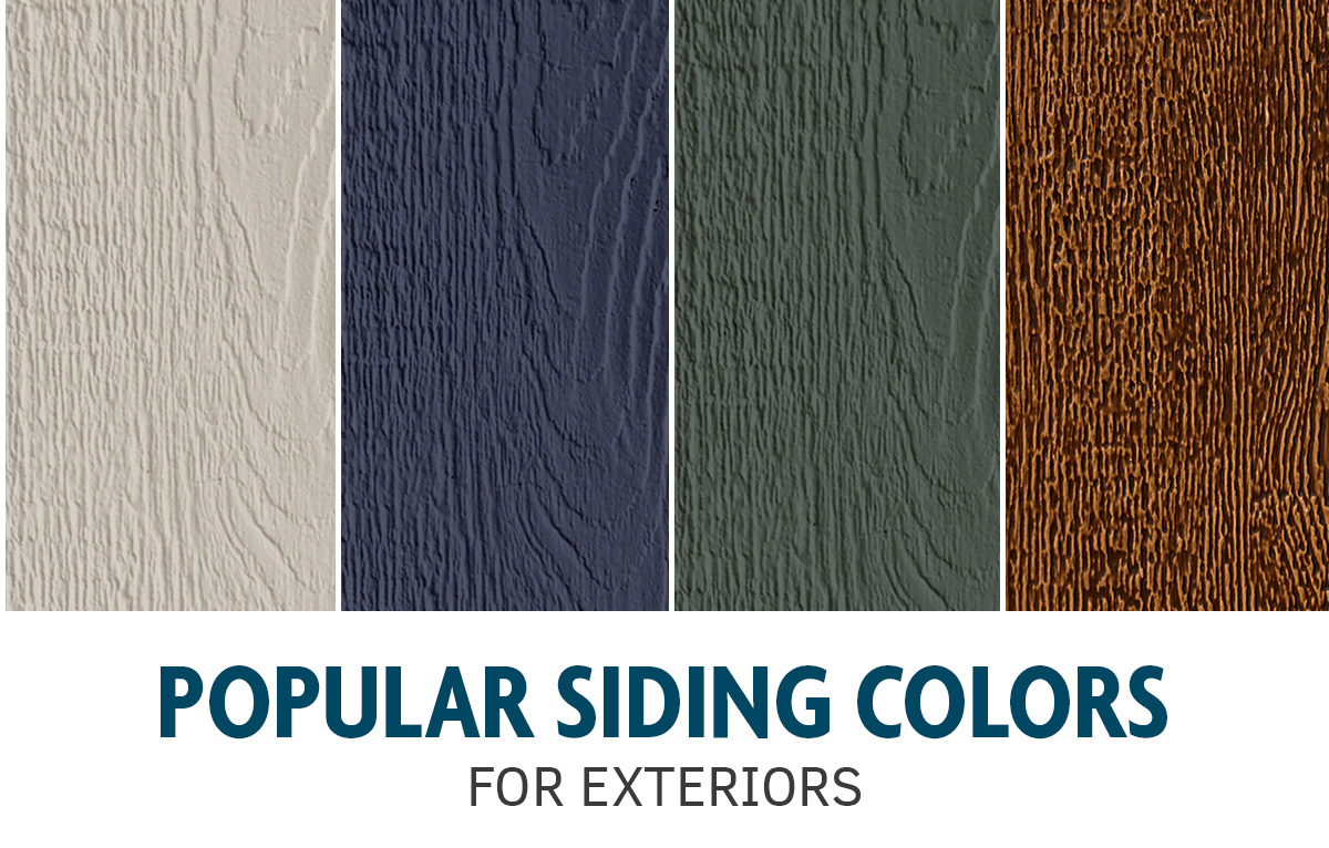
Popular Siding Colors for 2024
Choosing the right siding color can significantly impact a home’s curb appeal and overall aesthetic. 2024 promises a diverse palette reflecting current design trends and homeowner preferences, moving beyond the traditional choices. This section will explore the top five predicted siding colors for the year, examining their nuances and suitability for different architectural styles.
Top Five Siding Colors for 2024
The following five colors are projected to dominate the siding market in 2024, reflecting a shift towards both timeless elegance and modern sophistication. These predictions are based on current industry trends, consumer surveys, and analysis of popular paint and siding manufacturers’ offerings.
| Color | Description | Undertones | Best Suited For |
|---|---|---|---|
| Agreeable Gray (Sherwin-Williams) | A versatile, soft gray with subtle warmth. | Hints of beige and brown, avoiding any stark coolness. | Traditional homes, Craftsman bungalows, and homes seeking a neutral yet inviting exterior. Imagine a charming Craftsman bungalow with dark brown trim, complementing the warm gray siding beautifully. |
| Naval (Sherwin-Williams) | A deep, rich navy blue with exceptional depth. | Black and subtle hints of green, providing a sophisticated and timeless look. | Victorian homes, coastal properties, and modern farmhouse styles. Picture a stately Victorian home with white trim and contrasting dark navy siding, creating a dramatic and elegant presence. |
| Iron Ore (Sherwin-Williams) | A nearly black, deep charcoal gray. | Subtle hints of blue and brown, making it less harsh than pure black. | Modern homes, contemporary designs, and homes aiming for a dramatic, sleek look. Envision a sharp, modern home with minimal landscaping, where the dark siding creates a powerful visual statement. |
| Repose Gray (Sherwin-Williams) | A calming, neutral gray with a slightly cooler tone. | Subtle gray-blue undertones, creating a sophisticated and airy feel. | Farmhouses, ranch homes, and homes seeking a classic yet understated elegance. Consider a charming farmhouse with white trim and this soothing gray siding, enhancing the home’s peaceful atmosphere. |
| Urbane Bronze (Benjamin Moore) | A warm, sophisticated brown with metallic undertones. | Hints of gold and copper, offering a rich and luxurious appearance. | Mediterranean-style homes, craftsman-style bungalows, and homes seeking a luxurious and upscale look. Imagine a Mediterranean-style villa with terracotta roof tiles, where this warm bronze siding perfectly complements the earthy tones. |
Reasons for Popularity
The popularity of these colors stems from several factors. The prevalence of Agreeable Gray and Repose Gray reflects a continued consumer preference for versatile neutrals that complement various landscaping styles and architectural details. The rise of Naval and Iron Ore speaks to a growing trend towards bolder, more dramatic exterior choices, adding a sense of sophistication and modernity. Finally, Urbane Bronze highlights a shift towards warmer, earthier tones that provide a sense of richness and luxury. These colors all offer excellent durability and are easy to maintain, adding to their appeal for homeowners.
Color Psychology and Siding Choices
The exterior color of a home significantly impacts its overall aesthetic appeal and the emotional response it evokes in viewers. Understanding the psychological effects of different colors can be invaluable when selecting siding, allowing homeowners to create a specific atmosphere and enhance their property’s curb appeal. Color psychology plays a crucial role in shaping perceptions of warmth, coolness, modernity, and overall home personality.
Color influences our perception of a home’s size, style, and even its perceived value. The strategic use of color can make a smaller home appear larger or a dated home seem more contemporary. Choosing the right siding color can transform the entire look and feel of a property, making it inviting, sophisticated, or even playful, depending on the desired effect.
Warm and Cool Color Effects on Siding
Warm colors, such as reds, oranges, and yellows, generally evoke feelings of warmth, comfort, and energy. They can make a home feel inviting and welcoming, suggesting a sense of vibrancy and traditional charm. However, overuse can sometimes appear overwhelming or even aggressive. Cool colors, including blues, greens, and grays, on the other hand, project a sense of calmness, serenity, and sophistication. They can make a home feel spacious and modern, offering a sense of tranquility and understated elegance. The right balance is key; too much cool can feel stark or impersonal.
Comparative Analysis of Warm and Cool Siding Colors
The choice between warm and cool siding colors significantly impacts a home’s curb appeal. Warm colors often create a bold statement, making the house stand out. Imagine a sunny yellow or a rich terracotta – these colors instantly draw the eye and project a sense of cheerfulness. Conversely, cool colors offer a more subtle and refined aesthetic. A calm blue or a sophisticated gray can create a feeling of understated elegance and modernity, complementing various architectural styles. The success of either choice depends heavily on the surrounding landscape, architectural style, and personal preferences.
| Warm Colors | Cool Colors |
|---|---|
| Red: Evokes feelings of energy, excitement, and passion. Can appear bold and traditional. | Blue: Projects calmness, serenity, and trustworthiness. Often associated with sophistication and spaciousness. |
| Orange: Suggests warmth, friendliness, and creativity. Can be vibrant and inviting. | Green: Conveys a sense of nature, growth, and tranquility. Can feel refreshing and harmonious with the environment. |
| Yellow: Projects happiness, optimism, and cheerfulness. Can make a home feel bright and welcoming. | Gray: Offers a neutral and versatile backdrop. Can appear modern, sophisticated, and timeless. |
Siding Color Trends by Architectural Style
Choosing the right siding color can significantly impact a home’s overall aesthetic, enhancing its architectural features or, conversely, detracting from them. The interplay between color and architectural style is crucial for creating a cohesive and visually appealing exterior. Understanding current color trends within the context of different architectural styles allows for informed decisions that maximize curb appeal and property value.
Color selection should be guided by the inherent characteristics of the architectural style. Certain colors naturally complement specific architectural details, while others can clash, creating an unbalanced or visually jarring effect. For example, a bold, vibrant color might overwhelm a delicate Victorian home, while a muted palette might fail to highlight the modern lines of a minimalist design. Careful consideration of these relationships ensures a harmonious and aesthetically pleasing outcome.
Siding Color Palettes by Architectural Style
| Architectural Style | Recommended Color Palettes | Illustrative Descriptions |
|---|---|---|
| Victorian | Deep jewel tones (emerald green, sapphire blue, ruby red), muted creams, warm browns | These rich colors accentuate the intricate details and ornate features common in Victorian architecture. Imagine a deep emerald green siding offset by cream-colored trim, highlighting the gingerbread detailing and creating a sense of richness and history. The warm browns add grounding and visual warmth. |
| Ranch | Earthy tones (taupe, beige, sage green), muted grays, warm browns | Ranch homes often benefit from a palette that evokes a sense of natural simplicity and integration with the landscape. A warm taupe siding with darker brown accents around the windows and doors creates a grounded, inviting feel. Muted grays add a touch of sophistication without overpowering the style’s inherent casualness. |
| Farmhouse | Soft whites, creamy beiges, muted blues, gray-greens | Farmhouse styles often embrace a sense of rustic charm and tranquility. A soft white siding with contrasting darker gray-green accents on shutters and trim evokes a classic, timeless look. The creamy beiges add warmth and visual softness, complementing the home’s inviting atmosphere. Muted blues can provide a touch of whimsy. |
| Modern | Clean whites, grays, blacks, deep blues, charcoal | Modern architecture emphasizes clean lines and geometric shapes. A sleek, charcoal gray siding with crisp white trim provides a sharp contrast, highlighting the architectural precision. Deep blues can add a dramatic touch, while blacks create a sophisticated, minimalist feel. These colors avoid distracting from the home’s architectural integrity. |
The Influence of Natural Surroundings on Siding Color Selection
Choosing the right siding color is crucial for a home’s aesthetic appeal and overall harmony with its environment. Careful consideration of the surrounding landscape, nearby structures, and the interplay of light and shadow can significantly enhance the home’s visual integration and curb appeal. Ignoring these factors can lead to a jarring visual disconnect, diminishing the property’s value and charm.
The surrounding environment profoundly impacts how siding colors are perceived. Natural elements such as trees, vegetation, and the sky act as a backdrop, influencing the apparent shade and tone of the siding. Similarly, the presence of other buildings or structures in close proximity can create a visual context that needs to be addressed in siding color selection. Harmonizing the siding with the natural setting creates a cohesive and aesthetically pleasing result. Best practices include selecting colors that complement, rather than clash with, the existing palette. This might involve choosing earth tones to blend with a woodland setting or brighter, more reflective colors to enhance a coastal home’s airy feel.
Siding Color and Sunlight Interaction
Sunlight significantly affects how siding colors appear. Direct sunlight can make colors appear brighter and more saturated, while shaded areas might cause them to look darker and less vibrant. Therefore, selecting colors that complement both light and shadow is essential for a consistently appealing look throughout the day and across different seasons. Light-colored sidings reflect sunlight, keeping the home cooler in warmer climates, while darker colors absorb more heat. This factor should be considered in conjunction with local climate conditions. For example, a light grey or beige siding might be ideal for a sunny desert location, while a deep, earthy brown might be better suited for a shady woodland setting.
Siding Color Schemes for Different Natural Environments
Several color schemes effectively complement various natural settings. For a coastal home, consider light blues, greys, or whites that evoke the sea and sky. These colors create a sense of openness and airy spaciousness, harmonizing with the surrounding water and sandy beaches. Imagine a home with siding the color of driftwood, accented by white trim, perfectly mirroring the natural palette of the coast. The colors should reflect the light and airy feeling of the coastal environment.
For a woodland home, earthy tones such as browns, greens, and greys work exceptionally well. These colors blend seamlessly with the surrounding trees and foliage, creating a sense of natural integration. A deep brown siding, reminiscent of tree bark, paired with muted green accents, could beautifully complement the surrounding forest. This color scheme fosters a feeling of quiet tranquility and harmony with nature.
In a desert environment, light, neutral colors are preferable. These colors reflect sunlight, keeping the home cooler, and also prevent the harshness of the sun from overwhelming the home’s aesthetic. Think of light beige, sandy tans, or even a soft terracotta – these colors echo the natural palette of the desert, creating a sense of understated elegance. A pale beige siding with terracotta accents would visually integrate the home into the desert landscape without creating a stark contrast. This color palette helps the home blend in with its surroundings and mitigate the impact of the intense desert sun.
Innovative and Unexpected Siding Color Combinations
The year 2024 sees a departure from traditional siding choices, with homeowners embracing bolder, more creative color palettes. This trend reflects a growing desire for personalized expression and a move away from the uniformity often associated with suburban landscapes. Unexpected color combinations are not only visually striking but also offer a unique opportunity to enhance the overall aesthetic appeal and curb appeal of a home.
Unexpected and creative siding color combinations are becoming increasingly popular, reflecting a broader shift towards individualized home aesthetics. These pairings often involve a primary color complemented by a secondary, contrasting hue, creating visual depth and interest. The success of such combinations relies on careful consideration of color theory principles, architectural style, and the surrounding environment. Strategic use of accent colors, such as on trim, doors, or shutters, can further elevate the design.
Examples of Unexpected Siding Color Combinations
Deep navy blue siding paired with bright white trim is a striking combination that evokes a sense of nautical elegance. The deep blue provides a sophisticated backdrop, while the crisp white trim creates a sharp contrast that highlights architectural details. Imagine a Cape Cod style home with this combination; the deep blue siding would create a rich, almost velvety appearance, while the white trim would make the windows and doors pop. The contrast is both elegant and visually arresting. Another example would be a muted sage green siding with charcoal grey trim and accents. The sage green offers a calming, natural feel, while the charcoal grey provides a grounding element that prevents the overall look from feeling washed out. This combination would work beautifully on a modern farmhouse, creating a sophisticated yet rustic aesthetic. Finally, a warm terracotta siding with a deep burnt orange accent on the roofline and window frames provides a southwestern flair. The terracotta provides a rich, earthy base, while the burnt orange accents add a touch of warmth and vibrancy. This combination works especially well in arid climates and would be striking on a Spanish-style home.
Effective Accent Color Usage
Successful accent color usage involves adhering to certain design principles. The accent color should complement, rather than clash with, the main siding color. A good rule of thumb is to choose an accent color that is either analogous (adjacent on the color wheel) or complementary (opposite on the color wheel) to the main color. Consider the overall style of the house. For example, a traditional home might benefit from subtle accent colors, while a modern home might be able to handle a bolder choice. The amount of accent color used is also crucial; too much can overwhelm the design, while too little may not have the desired impact. A balanced approach, strategically placing accent colors on key architectural features, is essential.
Unique and Stylish Siding Color Combinations
- Combination 1: A soft, dusty rose siding as the base color, accented with a deep teal on the shutters and front door. This unexpected pairing offers a romantic yet modern feel. Imagine a craftsman-style home with this combination; the dusty rose would create a soft, inviting backdrop, while the deep teal would add a touch of unexpected drama. The contrasting colors create a visually stimulating yet balanced aesthetic.
- Combination 2: A warm, mid-tone grey siding paired with a vibrant mustard yellow on the trim around windows and the porch. This combination provides a sophisticated yet cheerful aesthetic. Picture a ranch-style home with this scheme; the grey provides a neutral backdrop, while the mustard yellow adds a pop of warmth and personality. The subtle yet effective contrast creates a stylish and inviting home exterior.
- Combination 3: A deep charcoal grey siding with pops of a bright, coral orange on the front door and mailbox. This bold combination is ideal for modern homes. Visualize a contemporary home with this pairing; the charcoal grey provides a sleek, sophisticated base, while the coral orange adds a bold, unexpected element. The contrast is striking and unforgettable, creating a modern and visually arresting exterior.
Last Point
Ultimately, selecting the right siding color is a personal journey, blending your individual aesthetic with practical considerations. By understanding the latest trends, the psychological impact of color, and the influence of your surroundings, you can confidently choose a color palette that enhances your home’s beauty, reflects your style, and stands the test of time. Remember to consider the long-term impact of your choice and how it will harmonize with your home’s architecture and landscape for years to come.