Siding Color Trends: What’s Hot for 2024? This year’s exterior home design is all about embracing fresh, modern palettes and thoughtful color combinations. We’ll explore the top siding colors predicted for 2024, delving into their visual appeal, market trends, and even the psychological impact on potential buyers. From classic choices to daring new hues, we’ll uncover the trends shaping home exteriors and offer practical advice for choosing the perfect color scheme for your own home.
This exploration will cover emerging trends, effective color combinations, and the influence of siding materials on color selection and longevity. We’ll also showcase illustrative examples of complete home exteriors, demonstrating how the right siding color can enhance architectural style and overall curb appeal. Prepare to be inspired by the exciting possibilities for your next home improvement project.
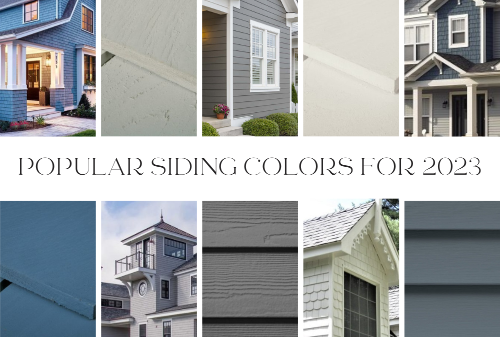
Popular Siding Colors for 2024
The exterior of a home significantly impacts curb appeal and overall property value. Choosing the right siding color is a crucial decision, influenced by current trends, personal preferences, and the surrounding environment. Understanding the predicted popular colors for 2024 can guide homeowners towards making informed choices that enhance their property’s aesthetic value and potentially increase its market appeal.
Top Five Siding Colors for 2024
The following table outlines the top five predicted siding colors for 2024, considering both market trends and the psychological impact on potential buyers. These selections represent a blend of classic appeal and modern aesthetics.
| Rank | Color Name | Color Hex Code | Brief Description |
|---|---|---|---|
| 1 | Agreeable Gray | #F2F0E6 | A versatile, warm gray that complements a wide range of architectural styles and landscaping. Its neutrality makes it a safe and timeless choice. |
| 2 | Deep Ocean Blue | #006994 | A sophisticated and calming dark blue evoking feelings of tranquility and stability. This color works well with modern and coastal homes. |
| 3 | Warm White | #FAF9F6 | A soft, creamy white that adds a touch of elegance and sophistication. It reflects light well, making homes appear brighter and larger. |
| 4 | Clay Beige | #D2B48C | A warm, earthy neutral that blends seamlessly with natural surroundings. It creates a sense of groundedness and comfort. |
| 5 | Iron Ore | #303030 | A deep, dramatic gray-black that offers a bold and modern aesthetic. This color makes a strong statement and works well with contemporary designs. |
Visual Appeal and Market Trends
The popularity of these colors stems from several factors. Agreeable Gray’s versatility ensures broad appeal, while Deep Ocean Blue reflects a growing trend toward calming, nature-inspired hues. Warm White remains a classic choice, conveying cleanliness and sophistication, while Clay Beige taps into the current preference for earthy tones. Finally, Iron Ore’s dramatic appeal caters to those seeking a modern, bold statement. These colors represent a balanced mix of classic reliability and modern design sensibilities, reflecting current market preferences for both timeless and trendy aesthetics. The consistent popularity of neutrals underscores their enduring appeal and suitability for diverse architectural styles and landscaping.
Psychological Impact on Homebuyers
Color psychology plays a significant role in how potential buyers perceive a home. Agreeable Gray’s neutrality promotes a sense of calm and peace, making it inviting and accessible. Deep Ocean Blue’s connection to nature evokes tranquility and stability. Warm White suggests cleanliness and spaciousness, while Clay Beige conveys a feeling of warmth and comfort. Iron Ore’s boldness reflects confidence and modernity, appealing to buyers seeking a contemporary aesthetic. These colors, therefore, not only enhance visual appeal but also tap into the emotional responses that influence purchasing decisions. For example, a buyer seeking a relaxing retreat might gravitate towards Deep Ocean Blue, while someone desiring a modern, stylish home might prefer Iron Ore.
Emerging Siding Color Trends for 2024
While classic neutrals continue to hold their own, 2024 sees a surge in bolder, more unexpected siding colors. These choices reflect a growing desire for personalized expression and a move away from purely traditional aesthetics. Homeowners are embracing colors that create a stronger statement and better complement their individual style and the surrounding landscape.
Deep Jewel Tones
Deep jewel tones, such as emerald green, sapphire blue, and ruby red, are gaining significant traction. These rich, saturated hues add a sense of sophistication and luxury to any home. Their popularity stems from a desire for colors that are both visually striking and enduring. They evoke a sense of timeless elegance and work well in various lighting conditions. These colors are particularly suitable for Victorian, Tudor, and Craftsman style homes, where their depth and intensity complement the intricate detailing and architectural features. The rise of these colors can be attributed to the increasing popularity of biophilic design, which emphasizes the connection between humans and nature, and the growing trend towards maximalist design, which celebrates richness and opulence.
Warm Neutrals with a Twist
While traditional beige and greige remain popular, we are seeing a shift towards warmer, more complex neutrals. Think terracotta, warm greys with subtle undertones of brown or olive, and dusty rose. These colors offer a sophisticated alternative to stark whites or greys, providing warmth and visual interest without being overly bold. They complement a wide range of architectural styles, from contemporary to farmhouse, blending seamlessly into diverse landscapes. This subtle shift in neutral tones reflects a move away from the minimalist aesthetic towards a more textured and inviting feel. The enduring popularity of neutrals, coupled with the desire for a slightly more nuanced and inviting color palette, fuels this trend.
Muted Earthy Tones
Muted earthy tones, including sage green, clay, and charcoal grey, are becoming increasingly popular. These colors offer a calming and natural aesthetic, seamlessly blending with the surrounding environment. Their versatility allows them to be used on a wide range of homes, from rustic farmhouses to modern minimalist designs. The growing awareness of sustainability and the desire to create a connection with nature are key factors contributing to the rise of these subdued, earthy tones. Their calming effect and adaptability make them an attractive option for homeowners seeking a tranquil and understated look. Examples of suitable architectural styles include modern farmhouse, ranch, and contemporary designs.
Dark and Dramatic Shades
Dark and dramatic shades, such as deep charcoal, black, and navy, are making a statement. While initially perceived as unconventional for siding, these colors create a striking and modern look, particularly effective on larger homes or those with strong architectural lines. These choices are often associated with a sense of drama and sophistication. They are ideal for contemporary, modern, and even some traditional styles, providing a strong contrast against lighter trim and landscaping. The increased confidence in using darker colors and the growing popularity of high-contrast design are significant drivers behind this trend. The use of dark siding can create a feeling of depth and mystery, adding a unique character to the home.
Soft Pastels with a Modern Edge
Finally, soft pastels are making a comeback, but with a modern twist. Instead of overly sweet or childish shades, we’re seeing sophisticated pastels like dusty blue, lavender grey, and blush pink. These muted tones offer a fresh and airy feel, suitable for various architectural styles. Their softer tones allow for a more calming and inviting ambiance, creating a home that feels both modern and serene. The resurgence of pastel shades reflects a move towards more gentle and calming color palettes, offering a respite from bolder, more intense hues. The use of muted pastels provides a unique blend of softness and contemporary design.
Color Combinations and Coordination
Choosing the right siding color combination—including the main siding, trim, and accent colors—is crucial for achieving a visually appealing and cohesive home exterior. The interplay of these colors significantly impacts the overall aesthetic, influencing the perceived size, style, and even the mood of your home. Careful consideration of color theory principles can help homeowners make informed decisions that enhance their property’s curb appeal.
Effective color combinations rely on understanding basic color theory. This involves considering the color wheel and the relationships between colors: complementary, analogous, and triadic. Complementary colors, located opposite each other on the color wheel (e.g., blue and orange), create high contrast and visual interest. Analogous colors, situated next to each other on the wheel (e.g., blues and greens), offer a harmonious and calming effect. Triadic colors, evenly spaced on the wheel (e.g., red, yellow, and blue), provide a vibrant and balanced palette. The chosen combination should also consider the home’s architectural style and the surrounding landscape.
Examples of Effective Siding Color Combinations
The following examples illustrate how different color combinations can create distinct visual effects. These combinations showcase the successful application of color theory principles to achieve appealing and harmonious exteriors.
- Combination 1: Classic and Elegant Siding: Warm Gray (#999999); Trim: Crisp White (#FFFFFF); Accent: Deep Charcoal Gray (#36454F). This combination utilizes analogous colors (grays) with a strong contrasting accent. The warm gray provides a sophisticated backdrop, the white trim adds brightness and definition, and the charcoal gray accents create visual interest without overwhelming the overall palette. This combination works well with traditional and craftsman-style homes, creating a timeless and elegant feel.
- Combination 2: Modern and Bold Siding: Deep Teal (#008080); Trim: Off-White (#F5F5DC); Accent: Copper (#B87333). This triadic combination uses a bold teal as the main color, creating a contemporary and striking look. The off-white trim provides a clean contrast, and the copper accents add warmth and a touch of unexpected luxury. This scheme is suitable for modern and contemporary homes, projecting a sense of sophistication and boldness.
- Combination 3: Rustic and Warm Siding: Beige (#F5F5DC); Trim: Dark Brown (#A0522D); Accent: Muted Red Brick (#8B4513). This combination employs analogous colors (earth tones) to create a warm and inviting feel. The beige siding acts as a neutral base, while the dark brown trim provides grounding and definition. The muted red brick accents add visual interest and a rustic charm, reminiscent of traditional farmhouses. This scheme is particularly well-suited to homes with a rustic or farmhouse style, enhancing their cozy and inviting atmosphere.
Impact of Color Combinations on Perceived Size and Style
Color choices can significantly impact how the size and style of a home are perceived. Lighter colors, such as whites, creams, and light grays, tend to make a home appear larger and more open, reflecting more light. Darker colors, such as navy, deep greens, or charcoal, can make a home seem smaller and more intimate, but can also create a feeling of grandeur and sophistication, depending on the architectural style. For example, a small bungalow painted in a light color might appear larger and airier, while a large Victorian home painted in a dark color might appear more stately and imposing. The use of contrasting trim colors can also influence the perceived proportions of a house; strategically placed darker trim can emphasize architectural details and create visual interest, while lighter trim can help to open up the space.
Siding Material and Color Impact
The choice of siding material significantly influences both the available color palette and the long-term performance of your home’s exterior. Different materials offer varying degrees of durability, maintenance requirements, and color retention, impacting the overall aesthetic and lifespan of your siding. Understanding these nuances is crucial for making an informed decision that aligns with your budget and aesthetic preferences.
The impact of material choice on siding color longevity and maintenance is substantial. For instance, wood siding, while offering a natural and aesthetically pleasing look, requires significantly more maintenance than other options. Its color can fade, chip, and be susceptible to rot and insect damage, necessitating regular repainting or staining. In contrast, vinyl siding is exceptionally low-maintenance, retaining its color for many years with minimal upkeep. Fiber cement siding falls somewhere in between, offering excellent durability and color retention but requiring occasional cleaning and potential repainting over its lifespan.
Color Options by Siding Material
Vinyl siding boasts a vast array of color choices, often featuring a wide range of shades and finishes, from classic whites and creams to bolder hues and wood-grain textures. However, the color options are limited by the manufacturing process, with some colors fading more readily than others under prolonged sun exposure. Fiber cement siding also offers a broad color selection, although typically with a slightly more muted palette than vinyl. Custom colors can often be achieved through painting, providing greater flexibility. Wood siding, while naturally beautiful, offers a limited palette of natural wood tones. While staining or painting can expand the color options, it increases maintenance needs.
Maintenance and Longevity of Siding Colors
The longevity of siding color is directly related to the material’s inherent properties and the environmental conditions it faces. Vinyl siding, due to its durable polymer composition, generally retains its color for 15-20 years or even longer with minimal fading. Fiber cement siding, with its cement-based composition, exhibits similar color retention, lasting for 15-30 years or more depending on the quality of the paint and the exposure to the elements. Wood siding, however, is highly susceptible to weathering and requires regular maintenance – staining or repainting every 3-5 years to maintain its color and protect the wood from damage. The intensity of sunlight, humidity, and temperature fluctuations all influence the rate of color fading for all materials.
Best Color Choices for Different Siding Materials
Choosing the right color for your siding material depends on several factors, including your home’s architectural style, surrounding landscape, and personal preference. However, considering the material’s properties is key to achieving a long-lasting and aesthetically pleasing result.
- Vinyl Siding: Light and neutral colors, such as whites, creams, and light grays, generally reflect sunlight more effectively, minimizing heat absorption and prolonging the life of the color. Darker colors, while stylish, may fade faster due to increased heat absorption.
- Fiber Cement Siding: Fiber cement offers greater flexibility in color choice. Darker colors are viable, but require careful consideration of potential heat absorption and maintenance needs. Lighter, neutral tones generally remain vibrant longer.
- Wood Siding: Natural wood tones tend to complement the material’s inherent beauty and age gracefully. While staining or painting expands the color palette, it requires regular maintenance to protect the wood and maintain the desired hue. Consider choosing stains that are formulated for UV protection to prolong color life.
Illustrative Examples of Siding Color Schemes
To further solidify the understanding of current siding color trends, let’s examine three distinct homes, each representing a different approach to exterior design. These examples highlight how siding color, in conjunction with roof color and landscaping, creates a cohesive and visually appealing aesthetic.
The following examples demonstrate the impact of careful color selection on the overall impression of a home’s exterior. Note that these are illustrative examples, and many variations are possible within each scheme.
Traditional Farmhouse with Warm Tones
This example features a classic farmhouse design with a focus on warm, inviting colors. The combination creates a welcoming and timeless feel.
- Siding Color: A warm, creamy off-white, such as “Swiss Coffee” or a similar shade. This provides a clean, bright base.
- Roof Color: A deep charcoal gray or a dark brown shingle roof offers a striking contrast to the light siding, adding visual interest and definition.
- Landscaping: Lush green lawns, complemented by flowering shrubs and mature trees, enhance the natural, rustic feel. The greenery provides a vibrant counterpoint to the muted siding and roof colors.
- Architectural Style: A classic farmhouse with large windows, a wraparound porch, and possibly some exposed beams. The color scheme complements the traditional architectural elements.
The overall aesthetic is one of relaxed elegance. The warm off-white siding provides a feeling of spaciousness, while the dark roof anchors the design and adds sophistication. The landscaping further enhances the feeling of a comfortable, lived-in home, perfectly suited to its style.
Modern Coastal Home with Cool Tones
This example showcases a contemporary coastal home that leverages a cool, calming palette.
- Siding Color: A light gray-blue, reminiscent of the sea, such as “Coastal Fog” or a similar shade. This creates a serene and airy feel.
- Roof Color: A lighter gray or even a white roof maintains a consistent cool tone and prevents the home from feeling too heavy.
- Landscaping: Low-maintenance landscaping with drought-tolerant plants in shades of gray-green and silvery blue complements the cool color scheme. Perhaps some strategically placed driftwood or beach grasses.
- Architectural Style: Clean lines, large windows, and an open floor plan are characteristic of this modern coastal design. The color scheme enhances the minimalist and sophisticated feel.
The cool tones create a sense of calm and tranquility, reflecting the coastal environment. The light colors make the home feel open and airy, while the carefully chosen landscaping seamlessly integrates the home into its surroundings.
Mid-Century Modern with Bold Accents
This example demonstrates the use of a mid-century modern aesthetic with a bold color scheme.
- Siding Color: A muted, mid-tone green, such as “Sagebrush” or a similar shade. This provides a sophisticated and unexpected base.
- Roof Color: A contrasting shade, perhaps a burnt orange or terracotta, adds a pop of color and visual interest. This bold choice complements the mid-century aesthetic.
- Landscaping: Minimalist landscaping with clean lines and geometric shapes would complement the architectural style. Succulents and other low-maintenance plants in complementary colors could be incorporated.
- Architectural Style: Characterized by clean lines, geometric shapes, and an emphasis on functionality. The bold color scheme reflects the mid-century modern design’s emphasis on bold design choices.
The unexpected combination of the muted green siding and the bold roof creates a striking yet balanced aesthetic. The minimalist landscaping keeps the focus on the architectural lines and the color interplay, resulting in a modern and sophisticated look.
Outcome Summary
Ultimately, selecting the perfect siding color for your home in 2024 involves considering both current trends and your personal preferences. By understanding the psychology of color, the impact of different materials, and the principles of effective color combinations, you can confidently choose a scheme that enhances your home’s aesthetic appeal and reflects your individual style. Remember, the exterior of your home is the first impression, making the right color choice a crucial design element.